Detailed planning – PERT – part 3
Cumulative Probability graph
Whilst data in tables is great it is much easier to see what is happening and utilise the data in graphical form.
We saw previously an example of a population of 20 results from running an event 20 times.
The values in order were:
18, 21, 21, 22, 22, 23, 23, 24, 24, 25, 26, 27, 27, 27, 27, 28, 29, 31, 32, 34
It is not very often that a project is run in the same way more than once.
However, let us assume that we wish to construct a road 20 miles long and each mile is constructed by a separate contractor.
Let the 20 values above be the estimates, in months, for each contractor to complete their mile.
We already know the following information from these values.
Mean = 511 / 20 = 25.55
Median = (25 + 26) / 2 = 25.50
Mode = 27
Range = 16
Variance = Σx2/n - y2 = 15.55
Standard deviation = 3.94
We can plot a graph of Frequency v Time which is shown in the diagram below as the blue columns.
The Frequency scale goes from 0 to 5 and the Time goes from 16 to 36 months for the durations for completing each mile.
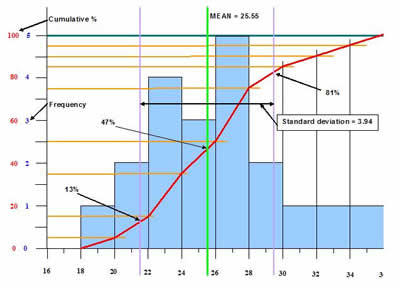

We can assess some information from this chart.
The Time axis is split into ‘class intervals’ of 2 months.
Within each of these we record the number of values that fell into each of these intervals.
For example, for the interval 22 to 23 months we had 4 values (22, 22, 23, 23).
Hence, the column height is 4.
Notice that the axis for months 22 and 23 goes from 22 to 24 (the beginning of the interval of 24 to 25).
When we carry this out for all of the values we get the distribution shown by the blue columns.
As we have only a limited number of values (20) and not many more (for example, 1000) the distribution is skewed slightly, in this case to the left.
For a larger number of values we would expect to see a more ‘normal’ distribution evenly about the centre.
For our example we know that the Mean = 25.55 and the Median = 25.50.
The Mean and the Median for a ‘normal’ distribution will represent a ‘middle’ point where there will be an equal number of values to the left and to the right.
That is, there is a 50% probability of achieving the Mean (or the Median) for a normal distribution.
We know from statistics that approximately 68% of all values will lie within 1 Standard Deviation of the Mean.
That is, 68% of values will lie within 25.55 – 3.94 = 21.6 and 25.55 + 3.94 = 29.49.
The limits of the 1 Standard Deviation is shown by the pale purple vertical lines.
The number of values within this range = 4 + 3 + 5 + 2 = 14, that is 70%.
As the total probability of getting values in this range is 68% (for a ‘normal’ distribution) and there is a 50% probability of achieving the Mean we can estimate the probability in achieving the values 1 Standard Deviation either side.
Hence, the probability of achieving each mile in 21.6 months = 50 – (68/2) = 50 – 34 = 16% and
the probability of achieving each mile in 29.49 months = 50 + (68/2) = 50 + 34 = 84%.
Naturally, the percentages total = 100%.
The data, as seen in the Frequency v Time graph can be displayed in a slightly different and useful manner.
Along the ‘Y’ axis we can plot Cumulative probability.
This is the overall total number of values recorded as a percentage of the total.
For example:
Interval 18 to 19 months values = 1
Interval 20 to 21 months values = 2
At this stage the overall total = 1 + 2 = 3 = 3/20 % = 15%
By carrying out this calculation at the end of each interval e can plot the graph of Cumulative probability v Time as seen by the red line.
We can use this graph to directly read off probabilities of achieving particular completion times.
For example, from the Frequency v Time graph we saw that there should be a 16% (for a ‘normal’ distribution) probability of achieving a completion for each mile of 21.6 months. The actual value here is about 13% due to the skew to the left.
Conversely, the probability of achieving 29.49 was 86% (for a ‘normal’ distribution) but the actual value above is only 81% due to the skew.
If we look at the ‘Y’ axis at 50% it corresponds to a Time of 25 months (for a ‘normal’ distribution) for each mile completion.
On the actual graph the Mean is at 47% due to the skew.
Hence, the Project Manager can use the Cumulative probability v Time graph to gain a feel of uncertainty in achieving particular times.
For example, in this case (as each contractor will be completing in parallel) the Project Manager will see that there is a 90% probability that it will complete at the end of month 31 and 85% probability of completing in month 29. If the Project Manager is not happy with these probabilities he or she may have to think about ways of improving it or accept that there may be a delay.
Risk management is covered in more detail in 'The Complete Risk Management package'.